


Upgrading Financial Tools with Analytical Power


Brand overview
Pepper Advantage is a global leader in financial services, renowned for its expertise in advanced analytics, investment management, and risk assessment. Its flagship platform, Horizon, offers clients state-of-the-art data visualization tools and deep financial insights, empowering them to make informed decisions and strategic plans. With a reputation for innovation and excellence, Pepper Advantage caters to a broad range of clients, including financial institutions, investment firms, and corporate enterprises.


Problem Statement
Pepper Advantage, a leading platform for financial data analytics, sought to revamp their data visualization capabilities within the Horizon platform. The challenge was to create visually appealing and functional UI designs that integrate seamlessly with Syncfusion elements while utilizing Tableau for interactive dashboard presentations. The goal was to enhance user experience and data interpretation for Pepper Advantage's clients through refined charts, tables, and comprehensive design guidelines.


Align's Solution
Align developed a strategic approach to create a tokenized UI design system that adhered to Pepper Advantage’s brand guidelines while integrating smoothly with Syncfusion elements. This solution focused on ensuring visual consistency and a user-friendly experience on the Horizon platform, leveraging Tableau’s capabilities for interactive data presentations.
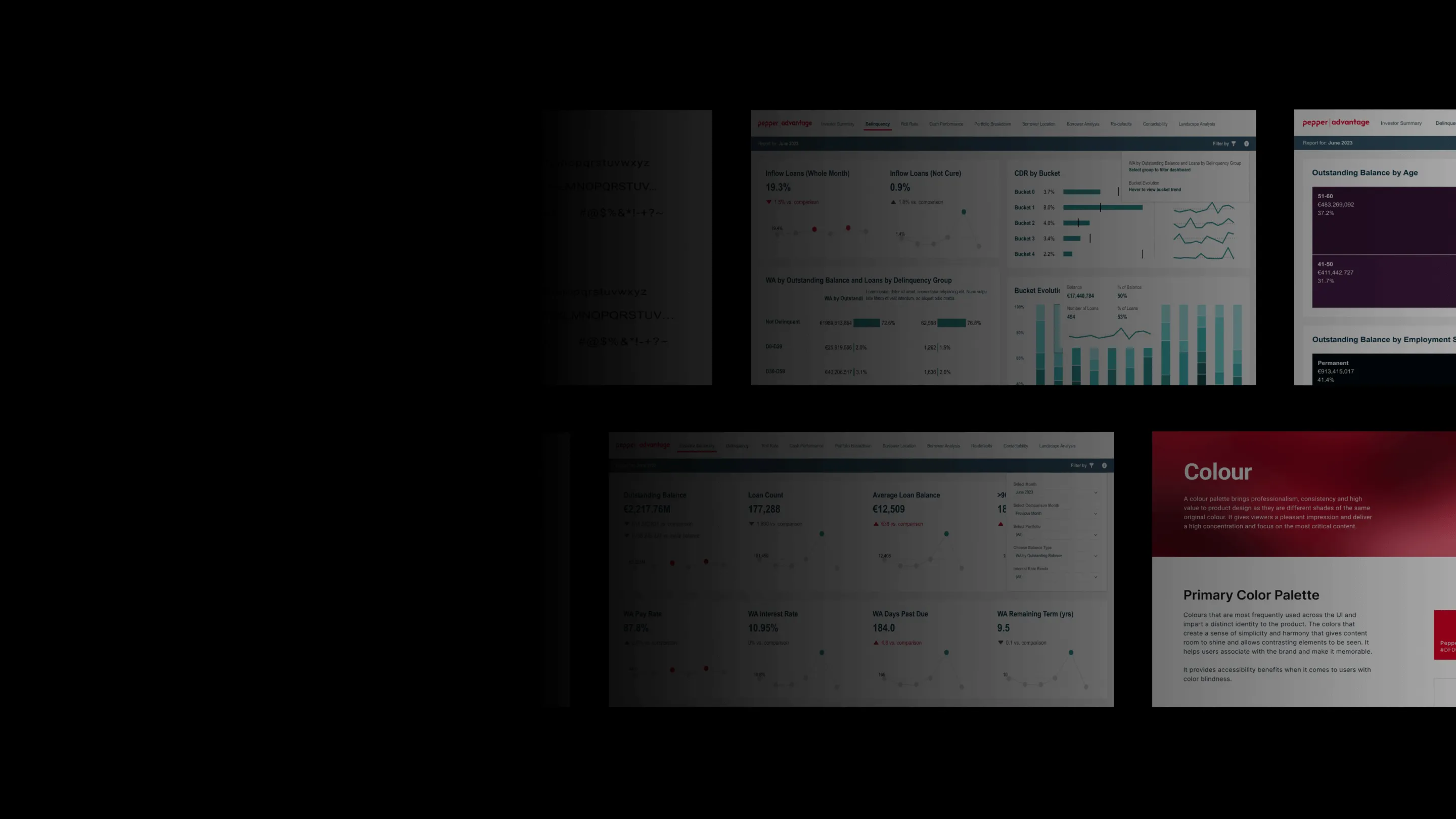
Crafted a UI/UX design that accommodated Tableau’s limitations and capabilities while incorporating Syncfusion’s style. Custom UI elements, dashboards, and charts were developed to optimize both functionality and visual appeal.
Integrated Syncfusion components into a unified design system, aligning with brand guidelines. Established comprehensive design guidelines, including typography, color schemes, backgrounds, spacing, and UI element tokenization for enhanced scalability and maintenance.
Results:
- Enhanced Usability: Improved navigation and functionality, leading to greater user engagement and satisfaction.
- Advanced Data Presentation: Enabled more intuitive visualization of complex data through well-designed charts, graphs, and dashboards.
- Cohesive Visual Identity: Reinforced brand recognition and trust with a consistent visual identity.
- Efficient Maintenance: Facilitated easier updates and modifications with a scalable design system.
Brand overview
Pepper Advantage is a global leader in financial services, renowned for its expertise in advanced analytics, investment management, and risk assessment. Its flagship platform, Horizon, offers clients state-of-the-art data visualization tools and deep financial insights, empowering them to make informed decisions and strategic plans. With a reputation for innovation and excellence, Pepper Advantage caters to a broad range of clients, including financial institutions, investment firms, and corporate enterprises.
Problem Statement
Pepper Advantage, a leading platform for financial data analytics, sought to revamp their data visualization capabilities within the Horizon platform. The challenge was to create visually appealing and functional UI designs that integrate seamlessly with Syncfusion elements while utilizing Tableau for interactive dashboard presentations. The goal was to enhance user experience and data interpretation for Pepper Advantage's clients through refined charts, tables, and comprehensive design guidelines.
Align's Solution
Align developed a strategic approach to create a tokenized UI design system that adhered to Pepper Advantage’s brand guidelines while integrating smoothly with Syncfusion elements. This solution focused on ensuring visual consistency and a user-friendly experience on the Horizon platform, leveraging Tableau’s capabilities for interactive data presentations.
Crafted a UI/UX design that accommodated Tableau’s limitations and capabilities while incorporating Syncfusion’s style. Custom UI elements, dashboards, and charts were developed to optimize both functionality and visual appeal.
Integrated Syncfusion components into a unified design system, aligning with brand guidelines. Established comprehensive design guidelines, including typography, color schemes, backgrounds, spacing, and UI element tokenization for enhanced scalability and maintenance.
Results:
- Enhanced Usability: Improved navigation and functionality, leading to greater user engagement and satisfaction.
- Advanced Data Presentation: Enabled more intuitive visualization of complex data through well-designed charts, graphs, and dashboards.
- Cohesive Visual Identity: Reinforced brand recognition and trust with a consistent visual identity.
- Efficient Maintenance: Facilitated easier updates and modifications with a scalable design system.


Aligned
